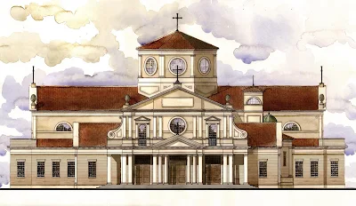
 The design is rather handsome and surprisingly ambitious in terms of ornamentation and complexity of form. The adaptation of the standard Roman Counter-Reformation front elevation, with volutes and a complex interplay of overlapping planes is a welcome and unexpected addition, as is the plan's indication of a separate, traditional baptistery, which is much more in line with received liturgical custom than the trendy practice of stranding the font in the narthex. One of the more interesting--and challenging--aspects of the design is how he has attended to the difficulty posed by most modern parish programs, which demand a whole host of accessory spaces not usually seen in traditional design, and which the architect has little choice but to accept and work around.
 Nonetheless, he has done a great deal to replace the jumbled program endemic to modern parishes back in line with the organically-developed, traditional longitudinal arrangement, that nonetheless provides for modern practical needs. This is worthy of much applause, given how many lesser architects often settle for simply coating a pseudo-traditional plan with Disney Gothic gewgaws. He has clearly made a considerable effort to discretely retain modern functions such as cry rooms and restrooms within the fabric while ensuring they do not overwhelm the church's sacramental hierarchy. The location of confessionals off the main body of the church is also a definite improvement on their usual banishment near the Eucharistic broom-closet.

The relatively low profile of the principal elevation probably is a consequence of this, as well as the challenge posed by squaring the large seating demands often seen with both verticality and the height restrictions posed by the budget. The architect has clearly risen to this challenge. The elevation and perspective show that Mr. Meleca has done a very subtle, clever job of working around it by diffusing and disguising the low mass with the forward movement of the facade's central portion, as well as the large octagonal lantern.

The interior is still somewhat under development. A rail has been added to enclose the define the otherwise fairly open sanctuary, a very pleasing addition. The altar's location under the lantern should also help give the chancel a further sense of enclosure and space. I hope, as the project develops and the interior continues to be refined, that perhaps a canopy or baldachin might be inserted to give further honor and dignity to the altar. A larger sacristy, or the insertion of a separate work sacristy, might be a good addition. That being said, I find the idea of a rear exterior balcony a rather pleasant addition to enliven an otherwise fairly utilitarian rear elevation. These few minor suggestions aside, the project looks to be most intriguing and I look forward to watching it develop over the next few years.

